Solbeg
brandbook
Welcome to Solbeg design book.
In these pages, we outline the core elements of Solbeg. To maintain and strengthen the desired perception for the Solbeg brand, visual identity elements have been enhanced and organized into this design book.
As a global organization, consistent branding across our regions is important. It helps recognize us as Solbeg and demonstrates our connection to one another. Anyone who represents Solbeg should ensure the integrity of the Solbeg brand in all branded materials.
Legal disclaimer
The materials in this brandbook may only be used for the purposes and to the extent agreed with Solbeg. It is not allowed to share, download or use the materials for any other purpose without prior approval from Solbeg. If you have any questions, please contact us: info@solbeg.com
Brand overview

Solbeg delivers a comprehensive array of software development and consulting services, offering a well-balanced blend of technology skills, domain knowledge, hands-on experience, effective methodology, and passion for IT.
Approach
Core
Custom software development
Professional support services

One-stop
partner
Mission
Through technology and high service standards Solbeg improves the quality of people’s life, help them to achieve more and enjoy life. With Solbeg people can avoid stress, save their time and mind for family and friends, for favorite activities making them happier and for world-changing ideas.
Values
- We help customers to build advantages over competition as well as to take unrivaled market position
- People, customers, customer success, partnership, quality
- Seamless tech upgrade
- High service quality standards
- Up-to-date tech knowledge
Features
- We deeply immerse into business needs and deliver an indeed valuable solution, not just a piece of code.
- Not just a code creator, but your one stop partner
- We are successful if our clients are
Brand identity

Name
Solbeg is a brand name that unites all our companies and businesses at all locations worldwide, which develops unity in diversity & sense of belonging to Solbeg international community for all Solbeg employees distributed worldwide and ensures brand consistency for Solbeg customers and partners.
While creating text and media content, branded assets (signboards, souvenir products, stationery, marketing collateral) we always use the name Solbeg and the logo Solbeg – Helmes Group. Helmes Group is an essential tagline always used with the Solbeg logo.
If there is a need to address a specific Solbeg location, please use the following name structure: Solbeg city/country office (e.g. Solbeg Minsk office).

Logo
Designing the logo, we picked up a "Coolvetica" font for modern and minimal style. It's a pure display typeface with tight kerning, intended for big headings and titles. The logo conveys reliability, sustainability, and technological effectiveness. Tag symbolizes the process and hints at the development of the brand, as there is a feeling that after a noticeable underline, it can be continued. The concept of the logo makes it convenient for branding the names of corporate events and locations (offices) of the company.
Basic version
Any text and media content, branded assets, promotional products.
Colourless version
This version is only used for Office applications and in the case of printing constraints.
Clear space

Let the logo breathe by leaving enough clear space around it.
Clear space measured from the corners should be at least the height of the letter l.
Minimum size
Logo height (Solbeg Helmes group) at least 50 px on screen or 10 mm in print.
Logo height (Solbeg) at least 20 px on screen or 5 mm in print.
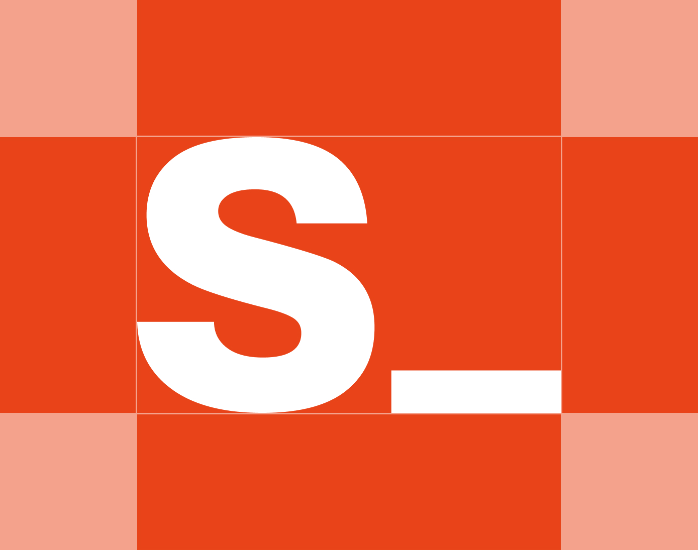
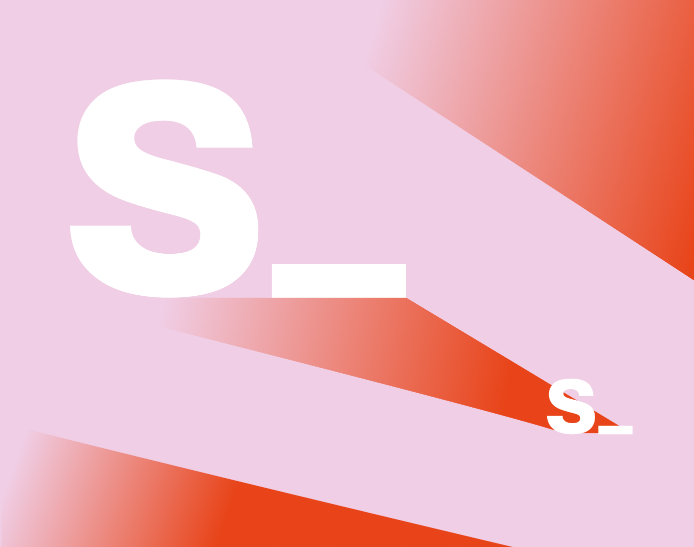
Symbol
Symbol reflects our brand built upon years of excellent teamwork. Our icon is a confident, understated letter 's' with tag '_'. The lowercase lettering speaks for our approachability and the tag reflects the balance of human and technology in our approach.
Basic version


Any text and media content, branded assets, promotional products.
Colourless version


This version is only used for Office applications and in the case of printing constraints.
Clear space
Let the symbol breathe by leaving enough clear space around it.
Clear space measured from the corners should be at least the height of the letter S/2.
Minimum size
Symbol with caption: at least 24 px on screen or 10 mm in print.
Colours
Color plays a prominent role in all our communications and is one of the cornerstones of our graphic vocabulary. It is a visual element that quickly identifies our design system. Our colors have been chosen to reflect our personality, remaining welcoming and friendly but always serious and professional. Color combinations are adaptable to tailor graphics and messages for the wide variety of markets and cultures.
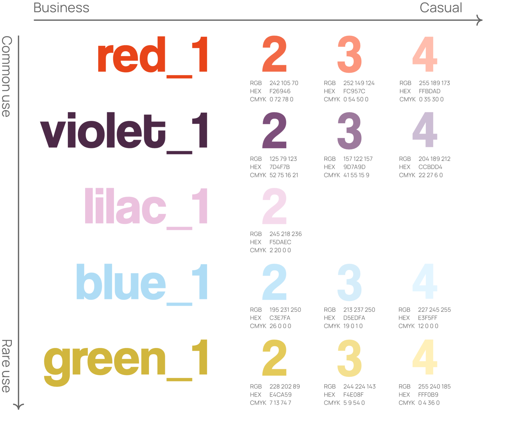
Primary colours
Primary colors help consumers to quickly identify a brand. These rich, deep colors are the core colors of the company and can be applied across the range of our corporate and marketing communication and promotional materials.
Accent colours
Accent colors highlight and compliment the primary color palette and used to enhance a color scheme.
Color palette usecase
A color palette is the full range of colors that a brand sets as their identity. This combines all the colors mentioned above into one palette. A color palette provides depth to brand.
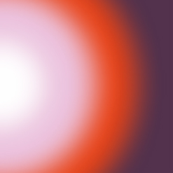
Gradients
Our brand gradients produces stunning gradients from brand colors. It blends the colors so that each
shade transitions into the next – creating an overall cohesive effect.
There are several types of color gradients that are commonly used in our brand:


While creating a new gradient use primary and accent colors marked from 1 to 4 according an effect you want to reach (deeper impact - 1, shallow impact - 4) and never mix colors with different tones e.g. red_1 → lilac_3 or violet_2 → lilac_1, etc.
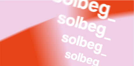
Typography
Typography is a strong extension of our brand’s personality and plays a major role in creating a consistent look for Solbeg across all communications and promotional materials. When applied consistently across the entire range of our corporate and marketing communications, typography helps to unify the appearance of all Solbeg materials, and help our audiences recognize and become familiar with Solbeg brand identity.
Typeface
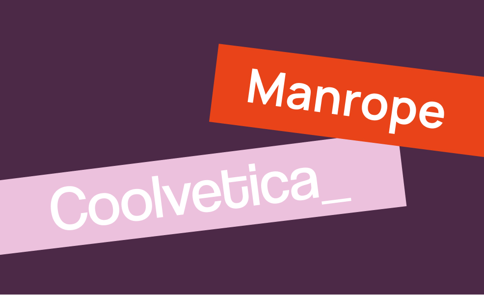
"Coolvetica" is our primary typeface. It should be used for all communications, including PowerPoint presentations and printed materials. Manrope is used for the body text. When using, observe the size, line height and letter spacing.
.TTF, .OTF files
Font usage
Using our chosen typefaces, the correct colors and weight, ensures that our typography is consistent and legible across all our communication channels.
Substitute font
Arial is near-copy of Coolvetica, updated slightly. Only when using the brand font is impossible, use Arial as a substitute for web purposes.
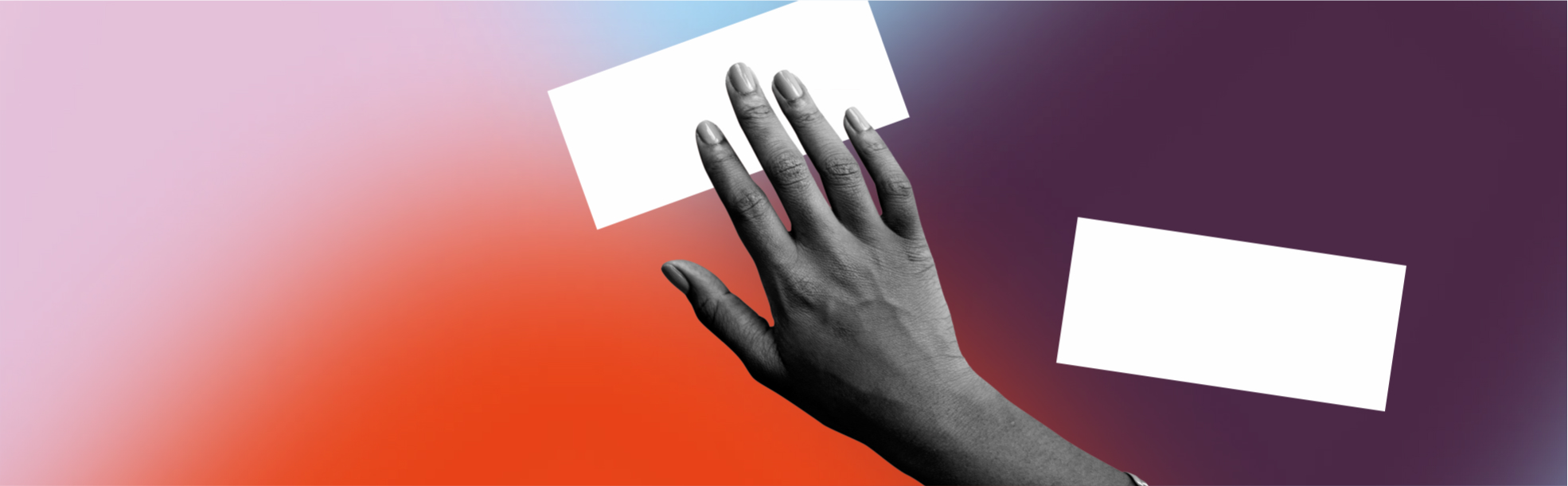
Photography
Brand photography represent business visually, and fit with visual identity through use of colors, tone, props, sets and more. These include photos of team, products, process, space and other things that make business unique.
Principles
Our photography style is light and natural. Photos are always authentic, local and optimistic. Light is also used as an active element in our photography, sometimes to the point of slight overexposure. Clean and minimal.

Tonality
Set the tone and convey the message of the brand or choose images that are tonally similar to the main photography in use.
Supporting elements
Icons, shapes, patterns, textures that are used to complement our brand — to pull out pertinent information, break up text and add additional dimensions to designs. They are the building blocks of composition.
Graphics
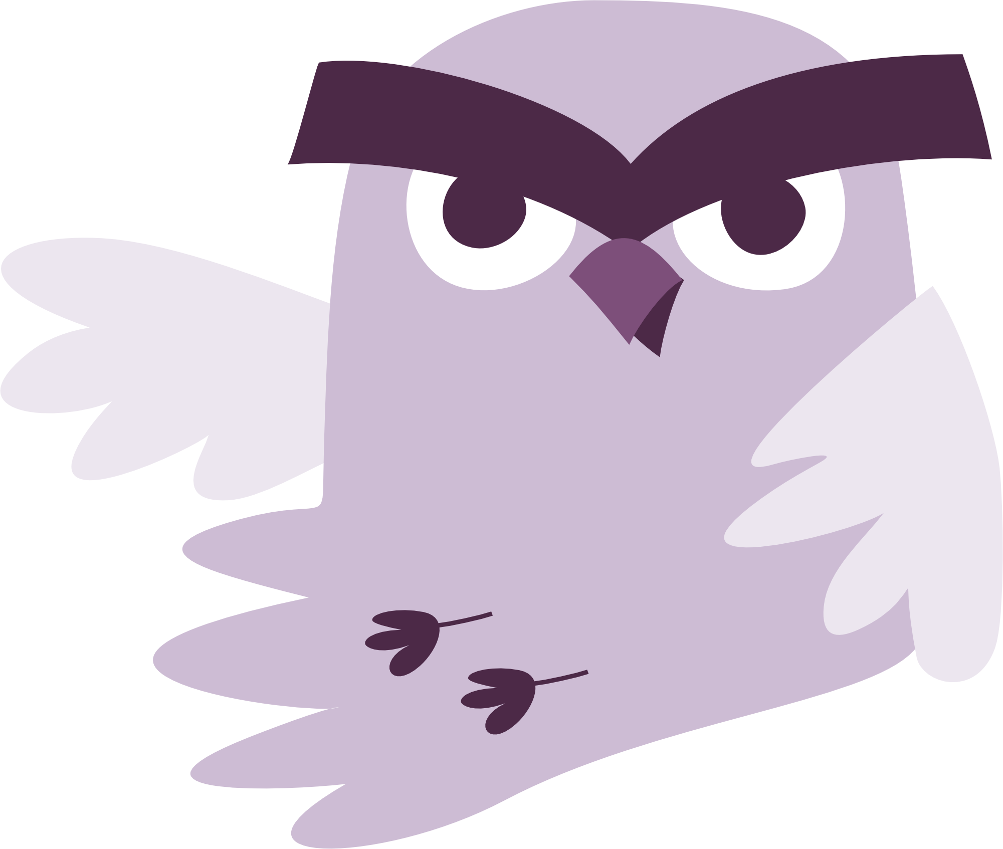
In our field, some concepts can be abstract. By using graphics we want to give colors, shapes, textures, and meaning to important but invisible things.
.PNG, .SVG files
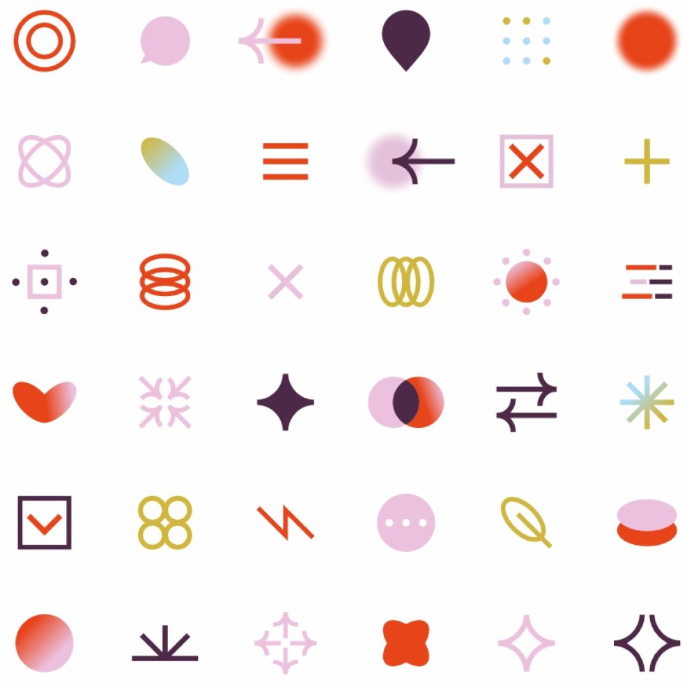
Icons
A small graphical representation is a great way to describe some concepts that can seem abstract, by giving an additional layer of information and ties our whole branding together.
.PNG, .SVG files
Brand application
Promotional products
Our branded merchandise reflects the balance between creativity and professionalism. It is a valuable means of connecting with our customers and employees, raising awareness of the Solbeg brand and driving loyalty.
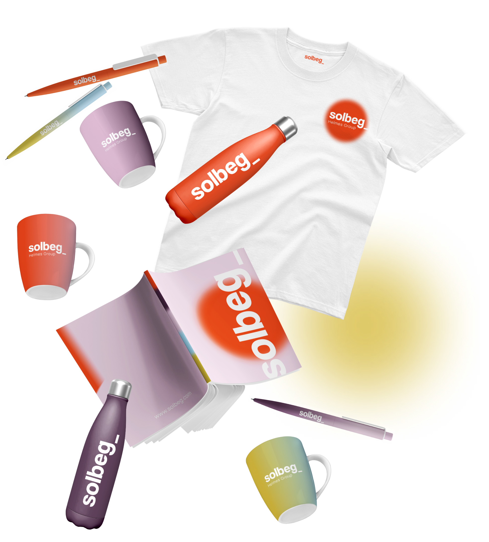
Promotional products—usually imprinted with a company's name, logo or message—include useful or decorative articles of merchandise that are utilized in marketing and communication programs.
Templates
Templates are a quick and easy way to maintain brand consistency in your PowerPoint presentations, documents, social media posts and etc. These tools take the guesswork out of proper logo placement while saving you time with pre-added design features.
Templates will continue to be added for your use.
Business cards
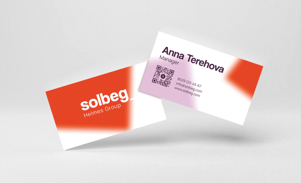
Size: 90×50 mm
Material: Paper/Cardboard 350g
.AI, .PDF files
Presentation slides
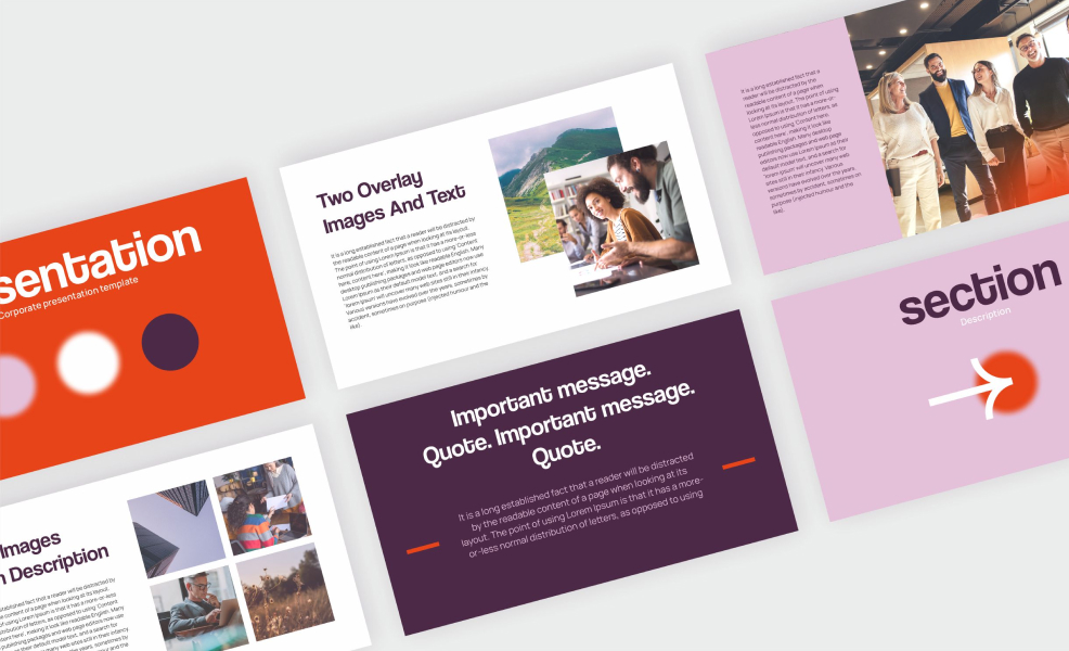
PowerPoint templates are available to meet your internal and external presentation needs. Templates are available in multiple designs and leverage graphic elements to keep brand consistent. Be sure to choose the template that best matches the content and audience of your presentation.
.PPTX files
Social backgrounds

As our first social-specific brand element, social backgrounds provide an easy way for you to incorporate visual brand consistency into your social network.
.JPG files
Documents
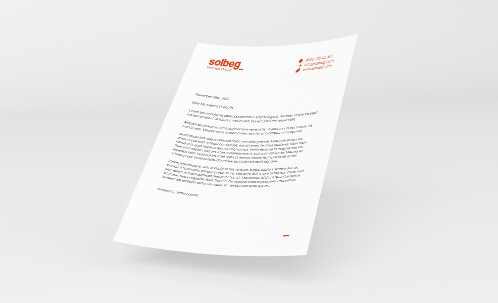
There are templates for Word documents in the corporate identity for various uses.
.DOCX files
Email signature
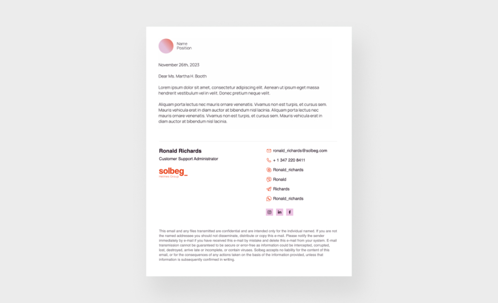
Use our corporate e-mail signature to increase brand awareness and reputation.
To add the signature, you need to
copy style, paste into Outlook and
modify
your personal information